Website Layout Options
The framework that defines the structure of a website.
Single Column Layout
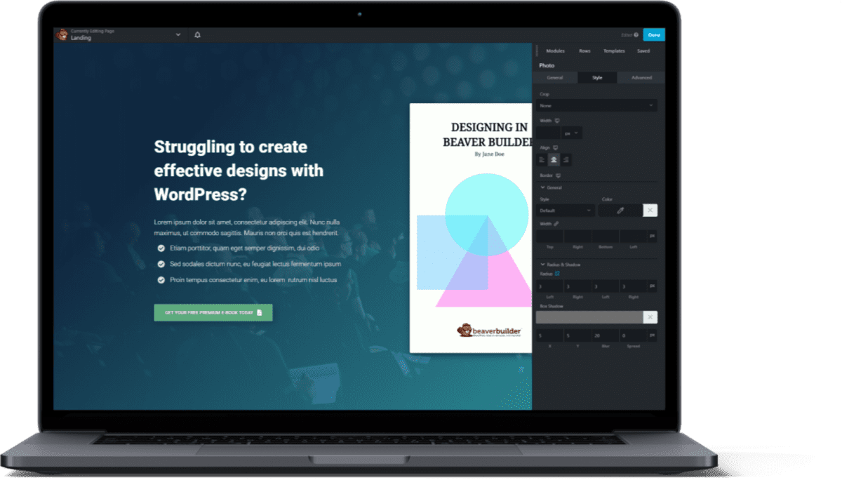
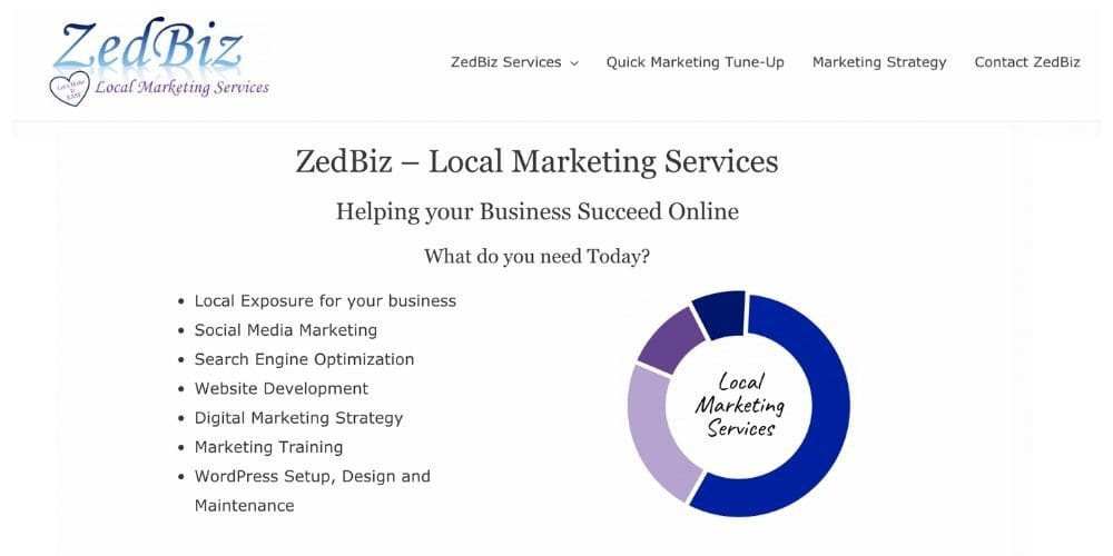
When used appropriately, single column layouts tick the boxes of both the user experience and the user interface, making it not only comfortable for users to visit your site (regardless of their device), but notably visually-pleasing as well.
Two Column Layout
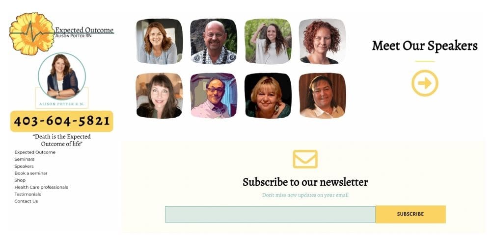
Two-column layout takes advantage of the page width, and makes room for rich, detailed visuals — alongside explanatory texts that find the minimal number of words they need in order to tell their story.

Magazine Style Layout
As the name implies, this layout approach is used extensively in magazines or news sites to show a large number of different stories. Inspired by print layout, they allow for the combination of headlines and imagery to introduce stories.

Grid Layout
Information is organized into grids, making it easy to browse., and people can stop to specific topics of interest. Grids allow for an equal distribution of text, photos, videos onto the webpages, letting users decide upon the importance of each unit.
Card-Based Layout
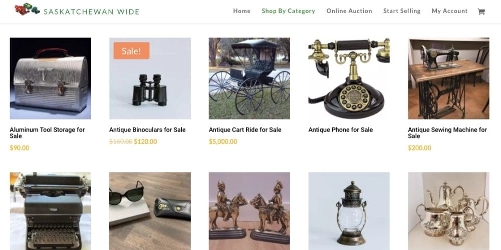
Card-based layouts are a great way to give people a series of options for the user to choose between, presenting them with enough information on each choice to make a decision.
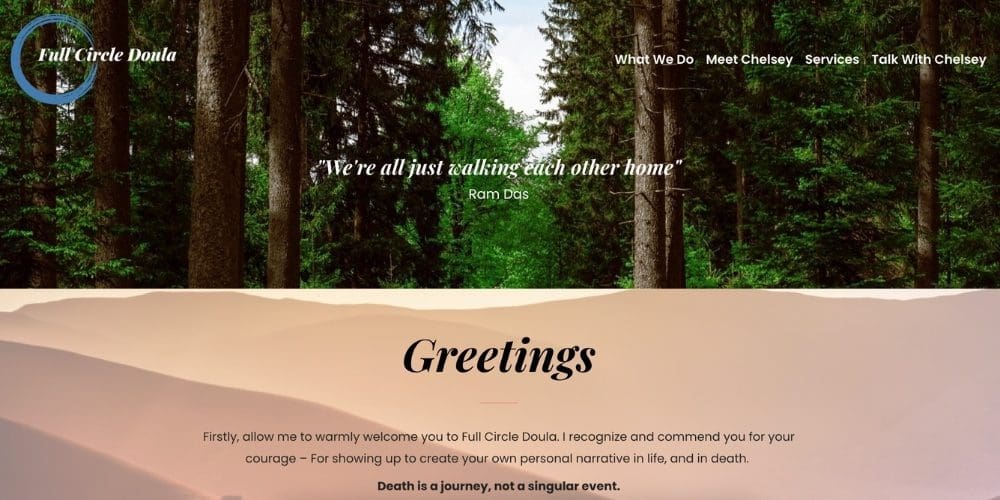
Full-Screen Media Layout
Full-screen layouts, as the name suggests, fit on a single screen with no need for the user to scroll. That makes them ideal for storytelling or presentations.
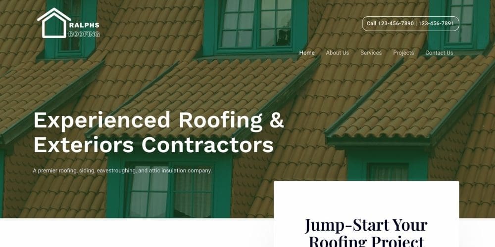
Hero Layout
The hero layout is named after hero images, those large images with text overlays that dominate the homepages on so many websites. Apple makes good use of the classic hero image.
